Why Real-Time Dashboards Outperform Static Reports
Real-time dashboards are defined as live data interfaces that refresh continuously, delivering current metrics to decision-makers within seconds or minutes rather than days. Static reports, by contrast, are fixed snapshots exported from systems like ERP platforms or spreadsheet tools, capturing data at a single point in time. The gap between those two approaches is not cosmetic. Companies in the top quartile of real-time capability achieve over 50% higher revenue growth and net margins than their peers. That figure comes from MIT Sloan research, and it reframes the static vs real-time debate from a technology preference into a competitive necessity. This article explains why real-time dashboards outperform static reports, what organizational conditions make that advantage real, and where the limits of live data actually lie.
Why real-time dashboards outperform static reports in decision speed
The core advantage of live data is not speed for its own sake. It is the elimination of what analysts call the "decision window gap," the period between when a problem emerges and when a decision-maker has the data to act on it.

Static reports create this gap structurally. A project manager running a weekly status report sees data that is already five to seven days old by the time the file lands in their inbox. They then schedule a meeting, investigate discrepancies, and align stakeholders before any action is taken. That process can consume two weeks. Data delivery timing in real-time systems runs from seconds to minutes; in static systems, it runs from days to weeks. The practical consequence is that decisions made from static reports are often responses to problems that have already escalated.
Real-time dashboards close this gap by surfacing the right metric at the right moment. A business analyst monitoring a product launch can see conversion rate drops within minutes of a pricing error going live, not after the weekend review cycle. The cost of that delay difference is not theoretical. Acting on yesterday's data leads to materially worse outcomes when timing is critical.
- Identify the decision window. Determine how quickly your team must act after a metric changes.
- Map current data latency. Calculate the actual time between data generation and when your team sees it.
- Quantify the cost of delay. Estimate revenue, quality, or customer impact for each hour of delayed response.
- Match refresh rate to urgency. Not every metric needs second-by-second updates. Align cadence to the decision, not the technology.
Pro Tip: Set a "data age" label on every dashboard panel. If a metric is 4 hours old, show it. Teams that see data age make better judgments about when to act and when to wait.
What organizational factors determine whether live data actually delivers value?
Real-time dashboards do not automatically produce better decisions. Real-time business advantage stems from four combined capabilities: data availability, empowered employees, organizational agility, and governance guardrails. Remove any one of those, and the performance premium shrinks.
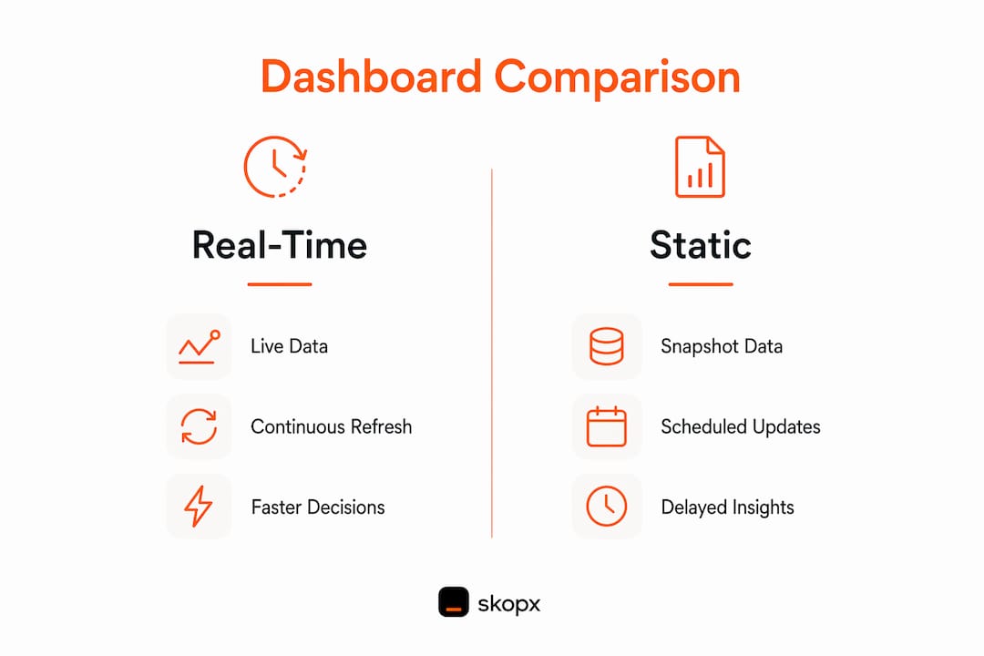
The most common failure mode is what analysts call "operational theater." A team installs a live dashboard, watches numbers update in real time, and takes no different action than they did with the weekly report. This happens when real-time visibility is added without redesigning the decision process around it. Without workflow alignment, real-time visibility produces operational theater rather than genuine performance gains.
Data trust is the second critical factor. Many teams mistake live charts for decision-grade freshness. A dashboard can display a number that refreshes every 60 seconds while the underlying data source reconciles only once per day. Fast but unvalidated data creates an illusion of control, not actual control. Before investing in real-time infrastructure, teams must confirm that upstream data sources reconcile at a speed that matches the dashboard's refresh rate.
Key conditions that determine real-time dashboard value:
- Decision window length. Short windows (under one hour) justify real-time investment. Long windows (weekly reviews) do not.
- Employee empowerment. Frontline teams must have authority to act on what they see, or the data sits unused.
- Governance guardrails. Clear metric ownership and escalation paths prevent alert fatigue and conflicting responses.
- Data trustworthiness. Upstream reconciliation speed must match the dashboard refresh rate.
- Process redesign. Workflows must be rebuilt around the new data cadence, not layered on top of old ones.
Pro Tip: Before deploying a real-time dashboard, run a "decision audit." For each metric on the board, name the person responsible for acting on it and the maximum acceptable response time. If you cannot name both, the metric is not ready for real-time display.
How do real-time dashboards support proactive insight delivery?
Static dashboards answer one question: what happened? Real-time analytics answer a different question: what is happening right now, and does anyone need to know about it immediately? That shift from passive to active insight delivery is where the advantages of live data become most concrete.
Static dashboards create an insight-to-action gap because they require a human to open the report, interpret the data, and decide whether something is wrong. Real-time analytics platforms surface anomalies automatically, routing alerts to the right person before they think to check. A supply chain analyst does not need to open a dashboard to learn that inventory for a top SKU just dropped below the reorder threshold. The system tells them.
AI-powered anomaly detection extends this further. Modern real-time analytics platforms use machine learning to distinguish normal variance from genuine signals, reducing false positives that cause alert fatigue. The result is a system that functions less like a report and more like an early warning network.
Operational improvements enabled by proactive insight delivery include:
- Faster incident response. Engineering teams using real-time error rate monitoring catch production issues in minutes, not during the next morning's standup.
- Revenue protection. Sales teams alerted to sudden drops in pipeline velocity can intervene before the quarter closes.
- Quality control. Manufacturing operations monitoring defect rates in real time can halt a production run before a batch failure compounds.
- Customer experience. Support teams tracking ticket volume spikes can reallocate agents within the same hour, not the next day.
The next evolution is agentic analytics, where AI agents do not just surface insights but execute predefined responses automatically. Platforms like Skopx's AI agents represent this direction, connecting real-time data to automated workflows that act without waiting for a human to open a dashboard.
What technical architecture enables true real-time dashboards?
The most common reason real-time dashboards underperform is not the front-end visualization. It is the data infrastructure underneath it. Traditional ERP systems and batch ETL pipelines were built for nightly or weekly data loads. Placing a real-time UI on top of a batch data foundation creates what architects call "real-time UI, batch truth", where the dashboard looks live but the numbers are hours old.
True real-time reporting requires streaming ingestion, where data flows continuously from source systems into a governed storage layer, rather than being pulled in scheduled batches. Tools like Apache Kafka handle streaming ingestion at scale. A unified data platform that integrates multiple operational systems in near-real-time is necessary to overcome ERP limitations in live reporting.
| Dimension | Static architecture | Real-time architecture |
|---|---|---|
| Data ingestion | Batch ETL, nightly or weekly | Streaming ingestion, continuous |
| Data freshness | Hours to days | Seconds to minutes |
| Anomaly detection | Manual review after export | Automated alerting on threshold breach |
| Decision support | Historical analysis | Current state plus trend projection |
| Infrastructure complexity | Low | Medium to high |
Aligning data refresh cycles to actual decision speed matters as much as the infrastructure choice. Constantly updating dashboards can increase cognitive load. Research on UX and refresh frequency shows that a "fresh enough" interval aligned with human decision speed, around 60 seconds for most operational metrics, produces better outcomes than pushing instantaneous updates.
Pro Tip: Audit your data pipeline before buying a real-time dashboard tool. If your source systems batch-sync overnight, a real-time UI will display stale data with a live appearance. Fix the pipeline first.
When should organizations prioritize real-time dashboards over static reports?
Real-time analytics is not the right answer for every reporting need. The business case depends on three factors: how short the decision window is, how high the cost of delay is, and how trustworthy the underlying data is. Organizations must assess whether their decision windows justify the complexity and cost of real-time systems before committing to the investment.
A weekly executive review of financial performance does not need second-by-second data. A fraud detection system monitoring payment transactions absolutely does. The mistake many teams make is applying real-time infrastructure uniformly across all reporting needs, which adds cost and complexity without proportional value.
Use this checklist to evaluate whether real-time dashboards are the right fit for a specific use case:
- The decision window is under four hours.
- A delay of one day or more causes measurable revenue, quality, or customer impact.
- The upstream data source reconciles at a speed that matches the intended refresh rate.
- A named employee has authority and a defined process to act on the metric.
- The team has completed a workflow redesign to act on the new data cadence.
- Governance and metric ownership are documented before go-live.
When these conditions are not met, near-real-time refresh (every 15–60 minutes) or scheduled batch refresh often delivers 80% of the value at a fraction of the infrastructure cost. Incremental adoption, starting with one high-urgency use case and expanding from there, reduces risk and builds organizational muscle before scaling.
Key Takeaways
Real-time dashboards outperform static reports when short decision windows, trusted data pipelines, and empowered employees are all present simultaneously.
| Point | Details |
|---|---|
| Decision window drives value | Real-time investment pays off only when delays of hours or days cause measurable harm. |
| Workflow redesign is required | Adding live data to old processes produces operational theater, not better decisions. |
| Data trust precedes speed | Upstream reconciliation must match dashboard refresh rate or the numbers mislead. |
| Proactive alerting beats passive viewing | Automated anomaly detection closes the insight-to-action gap faster than any manual review. |
| Incremental adoption reduces risk | Start with one high-urgency use case before scaling real-time infrastructure across the organization. |
The uncomfortable truth about real-time dashboards
At Skopx, we have worked with enough data teams to know that the biggest obstacle to real-time analytics is not technology. It is organizational honesty. Teams often adopt real-time dashboards because they feel modern, not because they have mapped a specific decision that requires faster data. The result is a beautiful live display that nobody acts on differently than they acted on the old weekly report.
The organizations that extract genuine competitive advantage from live data share one trait: they redesigned their decision workflows before they deployed the technology. They named metric owners, set response time expectations, and built escalation paths. The dashboard was the last step, not the first.
Update frequency is also misunderstood. Faster is not always better. A dashboard refreshing every three seconds for a metric that changes meaningfully only once per hour trains teams to ignore it. The right refresh rate is the one that matches the pace at which a human can actually respond. That is usually slower than engineers assume and faster than executives prefer.
Data literacy matters as much as data access. A project manager who understands confidence intervals reads a real-time chart differently than one who does not. Investing in self-service analytics capabilities alongside dashboard deployment produces teams that use live data well, rather than teams that are overwhelmed by it.
The competitive advantage from real-time dashboards is real. MIT Sloan's research makes that clear. But it is an organizational capability, not a software feature.
— Skopx
How Skopx brings real-time analytics to your decision workflows
Skopx connects to over 120 integrations, pulling live data from your operational tools into a single AI-driven interface where you can query metrics, detect anomalies, and trigger automated responses without writing SQL or building manual reports.
For teams ready to move beyond static reporting, Skopx's AI Data Analytics platform surfaces insights from live data streams and routes alerts to the right people automatically. The AI Data Agent goes further, executing predefined responses when thresholds are breached, closing the gap between insight and action without manual intervention. If your team is evaluating a move from batch reporting to live analytics, Skopx provides the infrastructure and the intelligence layer in one place.
FAQ
What is the main difference between real-time dashboards and static reports?
Real-time dashboards refresh continuously, delivering data within seconds or minutes of generation. Static reports are fixed snapshots that reflect data from a specific point in time, typically hours or days before the reader sees them.
Do all business decisions benefit from real-time data?
No. Real-time data adds the most value when decision windows are short and delays cause measurable harm. Weekly financial reviews, annual planning, and long-cycle strategic decisions perform equally well with scheduled batch reports.
What causes real-time dashboards to show stale data?
The most common cause is a "real-time UI, batch truth" architecture, where the dashboard interface refreshes frequently but the underlying data pipeline still runs on nightly or hourly batch cycles. Fixing the data pipeline is required before the dashboard can deliver genuine real-time accuracy.
How often should a real-time dashboard refresh?
Research on data visualization UX shows that a refresh interval aligned with human decision speed, approximately 60 seconds for most operational metrics, produces better outcomes than instantaneous updates. Faster refresh rates increase cognitive load without improving decision quality.
What organizational changes are needed before deploying real-time dashboards?
Teams must name a metric owner for each KPI, define the maximum acceptable response time, and redesign workflows to act on the new data cadence. Without those changes, real-time visibility produces operational theater rather than genuine performance improvement.
Recommended
Skopx Team
The Skopx engineering and product team