Data Visualization Best Practices 2026: Analyst Guide
Data visualization best practices in 2026 are defined as methods that prioritize rapid comprehension, trusted data, and accessible design to drive faster, more confident decisions. The three-second rule is the industry standard: if a chart fails to communicate its core insight within three seconds, it requires redesign. AI integration, real-time data refresh, and compliance with WCAG 2.2 and the European Accessibility Act now shape how analysts build and deliver visuals. The methods that separate effective from ineffective visualization in 2026 come down to clarity, governance, and purposeful design.
1. Data visualization best practices 2026: start with the right chart type
Choosing the wrong chart type is the most common and most costly visualization mistake. The analytical intent determines the format: bar charts for comparisons, line graphs for trends over time, stacked bars for composition, and scatter plots for correlation. Pie charts work only when you have two or three categories. Use them for more, and the human eye cannot accurately compare angles or areas.
Truncated axes in bar charts create visual deception. A bar chart starting at 80 instead of 0 makes a 5% difference look like a 50% gap. Length perception is more accurate than area or angle perception, which is why bar charts outperform bubble charts for most comparison tasks.

Pro Tip: Before selecting a chart, write the business question in one sentence. The verb in that question tells you the chart type: "compare" means bars, "track" means lines, "show proportion" means a stacked bar or treemap.
| Chart type | Best use case | Avoid when |
|---|---|---|
| Bar chart | Comparing discrete categories | More than 15 categories clutter the axis |
| Line graph | Showing trends over continuous time | Data points are not time-ordered |
| Stacked bar | Showing part-to-whole composition | Too many sub-segments obscure differences |
| Scatter plot | Revealing correlation between two variables | Audience is non-technical |
| Pie chart | Showing 2–3 part proportions | More than 3 segments are present |
2. Leveraging AI-powered visualization for deeper insights
AI now drives BI transformation by enabling natural language querying, where analysts ask complex questions and receive immediate visual and narrative responses. This removes the SQL barrier and puts direct data access in the hands of every team member. The result is faster insight cycles and broader adoption across non-technical stakeholders.
AI capabilities in 2026 go beyond query interfaces. Automated narrative summaries explain what a chart shows and why a metric changed. Anomaly detection flags outliers in real time before a human analyst spots them manually. Predictive and prescriptive analytics now embed directly into dashboards, giving analysts not just what happened but what is likely to happen next.
The risk is real. Failing to integrate AI-driven insights into your analytics workflow puts your organization at a measurable competitive disadvantage in 2026. Teams that rely on static weekly reports cannot match the decision speed of teams using live, AI-augmented dashboards.
Key AI capabilities to prioritize in your visualization stack:
- Natural language querying: Ask questions in plain English and receive charts instantly
- Automated anomaly detection: Surface deviations before they become crises
- Narrative summaries: Auto-generated text that explains metric changes in context
- Predictive overlays: Forecast lines embedded directly in trend charts
- Prescriptive recommendations: AI-suggested actions tied to specific data conditions
Pro Tip: Validate every AI-generated metric against your certified data governance layer before publishing it to a dashboard. AI surfaces patterns fast, but ungoverned metrics erode trust faster than any insight can build it.
Skopx connects with nearly 1,000 integrations and lets analysts query data and trigger actions through a single AI analytics interface, removing the need to switch between tools for each data source.
3. Designing dashboards for clarity and real-time decisions
The one-question-per-screen rule is the most underused principle in dashboard design. Every dashboard view should answer exactly one business question, with the answer placed prominently above the fold. Multiple questions per screen force the viewer to decide what matters, which slows decisions and increases the chance of misinterpretation.
Real-time data visualization is now standard in logistics and fintech, with dashboards refreshing every 30 seconds for live decision support. High-volume operational environments depend on fast refresh rates to catch deviations and failures before they escalate. A logistics dashboard that updates every five minutes is not a real-time tool. It is a delayed report with a modern interface.
Layout discipline matters as much as refresh rate. Headline metrics belong at the top left, where the eye lands first. Supporting context sits below. Drill-down detail lives one click away, not on the same screen.
| Dashboard type | Typical refresh rate | Primary use case |
|---|---|---|
| Operational (logistics, fintech) | 30 seconds or less | Live exception management |
| Executive summary | Hourly or daily | Strategic performance review |
| Marketing analytics | Daily | Campaign and channel performance |
| Financial reporting | Weekly or monthly | Budget and variance analysis |
For teams managing live data across multiple platforms, Skopx delivers cross-tool real-time analytics without requiring a custom data pipeline for each source.
4. Accessibility and inclusive design in data visualizations
Accessibility compliance moved from best practice to regulatory requirement in 2026. The European Accessibility Act and WCAG 2.2 now set the legal baseline for digital content, including data visualizations. Organizations that ship charts relying solely on color to convey meaning are out of compliance. The fix is not cosmetic. It requires rethinking how information is encoded.
Inclusive design benefits every user, not just those using assistive technologies. High-contrast color palettes improve readability in bright environments. Text labels on chart elements reduce cognitive load for all viewers. Keyboard navigation makes dashboards usable without a mouse, which matters in operational settings where analysts work across multiple screens.
Common accessibility failures and their fixes:
- Color-only encoding: Add pattern fills or direct labels so colorblind users read the same data
- Missing alt text: Write descriptive alt text for every chart image used in reports or web pages
- No keyboard navigation: Ensure all interactive elements are reachable and operable via keyboard
- Auto-playing animations: Provide a pause control or a reduced-motion alternative for users with vestibular disorders
- Low contrast text: Meet the WCAG 2.2 minimum contrast ratio of 4.5:1 for normal text on chart labels
The app design trends shaping UX in 2026 reinforce that inclusive design is now a baseline expectation, not a differentiator.
5. Data storytelling and interactive visualization techniques
Interactive and animated visualizations increase audience engagement, retention, and comprehension compared to static charts. Scrollytelling, where the narrative advances as the viewer scrolls, keeps attention anchored to the data story rather than letting the audience skip ahead. Animated transitions between chart states reveal patterns that a static before-and-after comparison cannot show.
Effective data storytelling follows a three-part framework: Context, Insight, and Action. Context sets the business problem. Insight explains what the data shows and why the metric changed. Action presents the decision options the data supports. Without all three, a chart is just a picture.
Mobile-first design is no longer optional for business dashboards. Analysts review key metrics on phones during meetings and travel. A dashboard that requires a 27-inch monitor to read is a dashboard that gets ignored.
- Scrollytelling: Guide viewers through a data narrative step by step as they scroll
- Animated chart transitions: Show change over time with motion rather than side-by-side statics
- Interactive filters: Let users slice data by dimension without leaving the view
- Tooltip overlays: Surface detail on hover without cluttering the base chart
- Mobile-responsive layouts: Reflow chart elements automatically for smaller screens
Pro Tip: Analyze interaction data from your dashboards monthly. If users never click a filter or drill-down, remove it. Unused interactivity adds complexity without adding value.
Animations in charts must stay subtle. Excessive motion distracts rather than guides, and it creates accessibility barriers for users with motion sensitivity. The rule is: animate to reveal, not to decorate.
Key Takeaways
Effective data visualization in 2026 requires trusted data, clear design, AI integration, and accessibility compliance working together, not as separate initiatives.
| Point | Details |
|---|---|
| Match chart to intent | Choose bar, line, or scatter based on the business question, not visual preference. |
| Apply the three-second rule | Redesign any chart that fails to communicate its core insight within three seconds. |
| Govern your metrics | Beautiful dashboards built on ungoverned data get abandoned; certify metrics before publishing. |
| Make accessibility mandatory | WCAG 2.2 and the European Accessibility Act make inclusive design a legal requirement in 2026. |
| Use AI with oversight | Natural language querying and anomaly detection accelerate insight, but require governance validation. |
What actually separates great visualizations in 2026
The analysts I see struggling most are not struggling with chart types or color palettes. They are struggling with data they do not trust. A certified metric rule is clear: beautiful visualization fails completely when the underlying data lacks trustworthiness. Governance and consistent metric definitions are not back-office concerns. They are the foundation of every dashboard that gets used.
The dashboards that get abandoned are almost always the ones that tried to answer too many questions at once. I have seen executive dashboards with 40 KPIs on a single screen. Nobody reads them. The teams that build focused, single-question views get faster decisions and fewer follow-up requests for manual reports.
AI and real-time analytics are genuinely powerful. I use them and recommend them. But I have also watched teams deploy AI-generated charts without any governance layer and end up with confident-looking visuals built on inconsistent data definitions. The technology is only as good as the data contract underneath it.
The best practice I keep returning to is iteration with real users. Build a dashboard, watch someone use it for 10 minutes without coaching them, and you will learn more than any design framework can teach you. Continuous feedback loops separate visualizations that inform from visualizations that impress.
Skopx Team
How Skopx supports your visualization and analytics workflow
Data professionals who want to put these principles into practice need a platform that connects their data sources, surfaces insights in real time, and removes the technical barriers between a question and an answer.
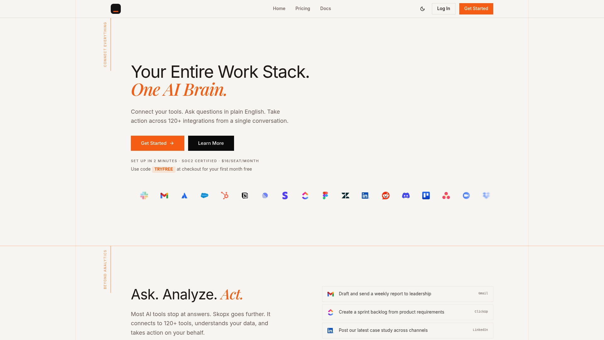
Skopx delivers a unified AI-driven interface that connects with nearly 1,000 integrations, letting your team query data and act on it without switching between tools. The AI Data Analyst platform automates analysis, generates narrative summaries, and surfaces anomalies across your connected data sources. For teams that need autonomous workflows, Skopx AI agents handle data processing and reporting tasks with minimal manual input. If your team is ready to move from static reports to live, governed, AI-augmented analytics, Skopx is built for that transition.
FAQ
What is the three-second rule in data visualization?
The three-second rule states that a chart must communicate its core insight within three seconds or it requires redesign. Charts that fail this threshold create cognitive overload and slow decision-making.
What chart types work best for business presentations in 2026?
Bar charts work best for comparisons, line graphs for trends, and stacked bars for composition. Pie charts are effective only when limited to two or three categories.
How does AI improve data visualization in 2026?
AI enables natural language querying, automated anomaly detection, and narrative summaries that explain metric changes in context. These capabilities reduce the time from data to decision for both technical and non-technical users.
What accessibility standards apply to data visualizations in 2026?
WCAG 2.2 and the European Accessibility Act set the compliance baseline. Requirements include color independence, keyboard navigation, sufficient contrast ratios, and reduced-motion alternatives for animated charts.
How often should operational dashboards refresh their data?
Logistics and fintech dashboards typically refresh every 30 seconds or less to support live decision-making. Less time-sensitive dashboards, such as executive summaries, refresh hourly or daily depending on the use case.
Recommended
Share this article
Skopx Team
The Skopx engineering and product team